Reading charts is one of the most important things in trading , even fundamental analyst use charts to see price movements. However most novice traders faces lot of difficulty in understanding and making sense out of price charts. In today’s blog i will try to show u a step by step guide how to analyse charts in just about 15 Mins .
Lets get started . Here are few things that you should know before we start with our step by step guide
There are several different ways to read a chart , however i follow the below points each time whenever i want to analyse any price chart
- Analyse a longer time frame chart , e.g 3, 5, 10 Years or so
- Find a trend
- Find support and resistance zones
- Use indicators like RSI and Moving averages
- Analyse a shorter time fame chart to place a trade
- Develop a trading plan
Lets apply these points on the chart one by one and see the final result
Take a look at below GBP/JPY chart ,
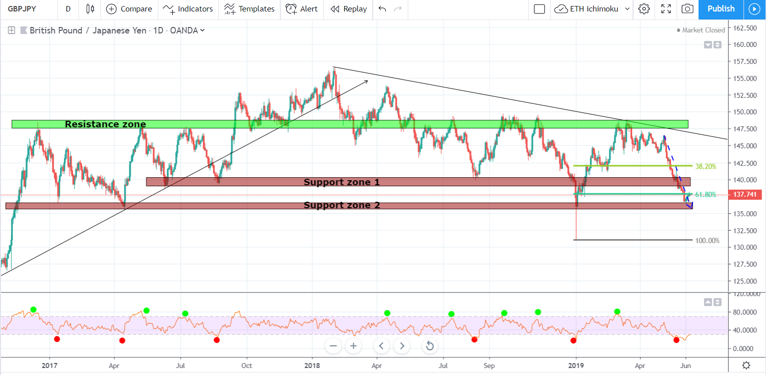
- First thing was to analyse a longer time frame chart and to find a trend Hence we have taken 3 year chart into our consideration
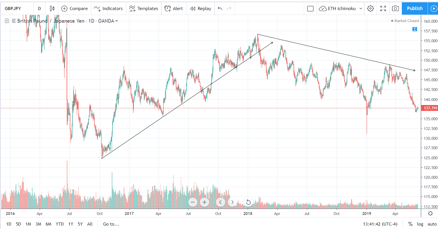
- Starting early 2016 prices have dropped a lot and reached to the lowest point on the chart in Oct 2016 – this is know as Downtrend – As prices are making newer lows
- After that prices started moving higher and higher with few major retracements and corrections , it has finally reached to one of the peak points in Jan 2018 – this is known as Uptrend as prices are making newer highs
- After Jan 2018 price started to drop again , with some major retracements and corrections – Downtrend again
Note : We found two major trends , uptrend from Oct 2016 to Jan 2018 and downtrend from Jan 2018 till now
2. Finding support and resistance zones is one of the most crucial thing to check while trading , it really helps in finding trend reversals and give us an indication to place the trade in the new trend direction . U will know more about finding these zones in my blog Finding trading opportunities
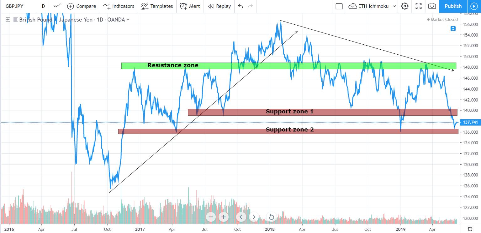
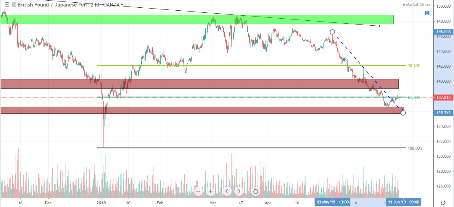
See the same chart above, converted into a line chart to plot zones in a better way , we found 2 support zones and one resistance zone as show in the chart below
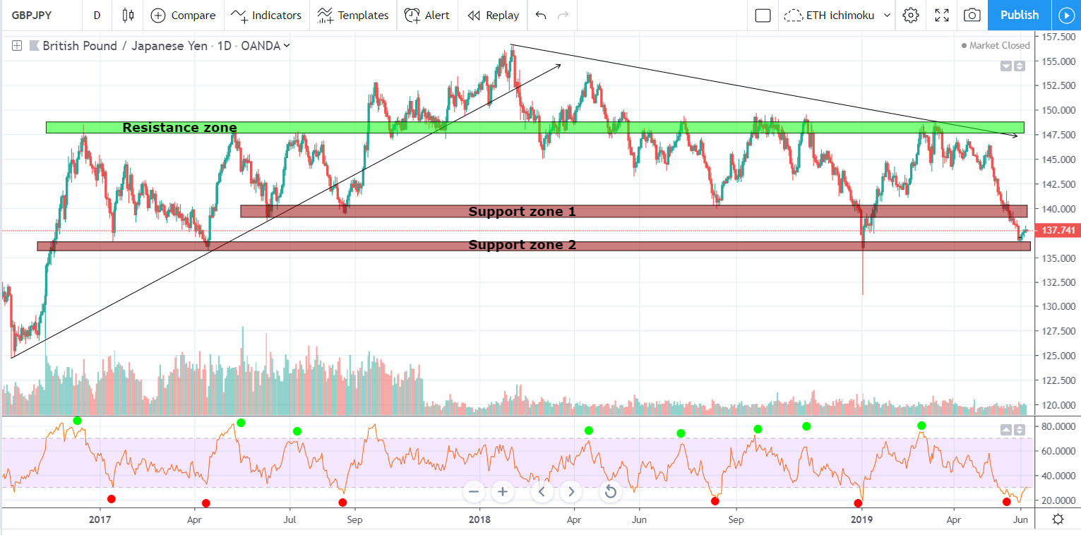
3. Use of indicators like RSI
RSI tells us if market is overbought or oversold , read this to know how i made 1000 dollars shorting Gold using simple RSI technique How i shorted gold and made a grand
See the chart below and try to notice a similarity again and again where Price have touched resistance zone and RSI was above 70 , i have plotted dots in green to make them clearly visible on the chart , Similarly try to look for red dots and they indicate just opposite where price have touched support zone and RSI was 30 or lower
4. Lets now move to the last part of reading the chart , analyse smaller time frame chart to see current trend and which helps to enter the trade at the right time , entry and exit can be easily calculated while seeing smaller time frame charts
The below is 4 hour chart of last 6 months and we have plotted Fibonacci levels to see price retracements level and we have created one more dotted trend line to mark the current downtrend
Lets conclude
We see that until Jan 2018 the price have moved up , how did we depict that on chart by creating trend line , after that price started moving down and have dropped a lot and we see the trend is down – so if the trend is down we should not go long until we see any trend reversal sign , the Fibonacci zone tells us that price have retraced more than 61.80% and reached our last support zone
Also closely look at the support zones and RSI we see the RED dots which indicated strong buy signal , we have plotted one red dot in May end where price have touched our support zone and RSI is lesser than 30 RSI is telling us that history is going to repeat again and price might start going up and to study this we need to closely look at even smaller time frame charts to gather recent price movements
15 Min chart
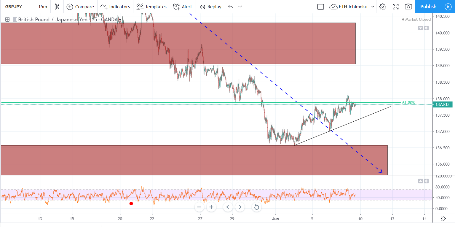
The chart above where we see price have consolidated in the end of may and then started going up and making new highs and it has also crossed the recent downtrend dotted line , we see a nice upwards movement, however remember the long term trend is down and we should only go long when we see signs of reversal or any price pattern which depict price reversal
Lets now look at what happened when price bottomed
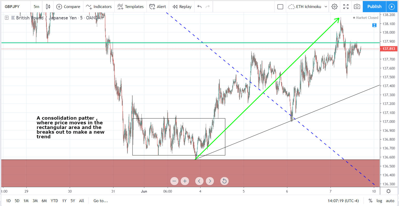
When price started moving in a horizontal manner , no new highs and lows were formed , this gave a sign of reversal or continuation pattern , this happens when buyers and sellers are fighting and no body is winning , and the suddenly price could break either upwards ( buyers are in control and pushed the price up) or downwards ( sellers are in control and pushed the price down ) , However what we see here is a sign of reversal where buyers took the control and broke the previous trend and starts to make higher highs.
You may follow these simple steps to define long term trend and it always recommended to trade in the direction of the trend until and unless to see major reversal pattern
I will try to write more about different trading techniques that i use to enter and exit the trade . till then try to follow these points and you will see major upgrade in the way you analyse charts
Take care stay fit